Final Thoughts
I had a lot of fun in this class. I also learned a lot about painting, and I could tell that my skills improved a lot. All of the paintings we did were different and caused me to go outside of my zone in painting. We worked with a few different types of paints, which also helped me to become a better painter and get practice with all different styles. My favorite painting was the pet portrait because I had never painting anything living or with fur. It used a lot of new techniques that we learned and it turned out very good. I had I fun time in the class and learned a lot.
Bob Ross
This was my first time following a Bob Ross video. It was really interesting to see how fast he worked. Following along was pretty fun, even though it was hard at times. I think to the point that I got to was pretty good. I followed what he did and even though it doesn't look exactly the same mine ended up turning out good in it's own way. Doing this painting was fun because It showed me easy ways to do things that end up looking good. It was a good experience but I would not recommend doing it to others.
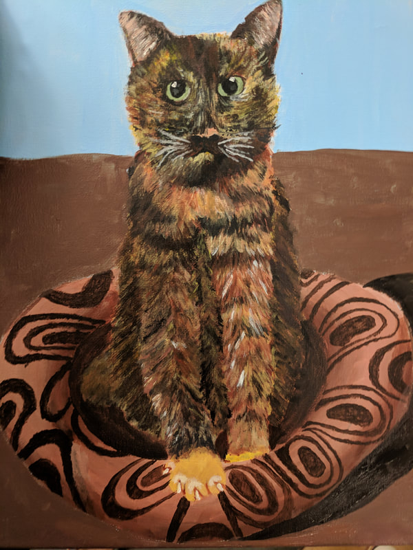
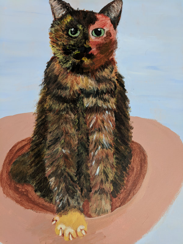
Pet Portrait
|
|
|
|
- For this critique I first want you to discuss your painting. Use your own words to describe, analyze, interpret and judge your artwork. Add art vocabulary to make your critique better. There are no questions to guide you so you need to be as in depth as possible.
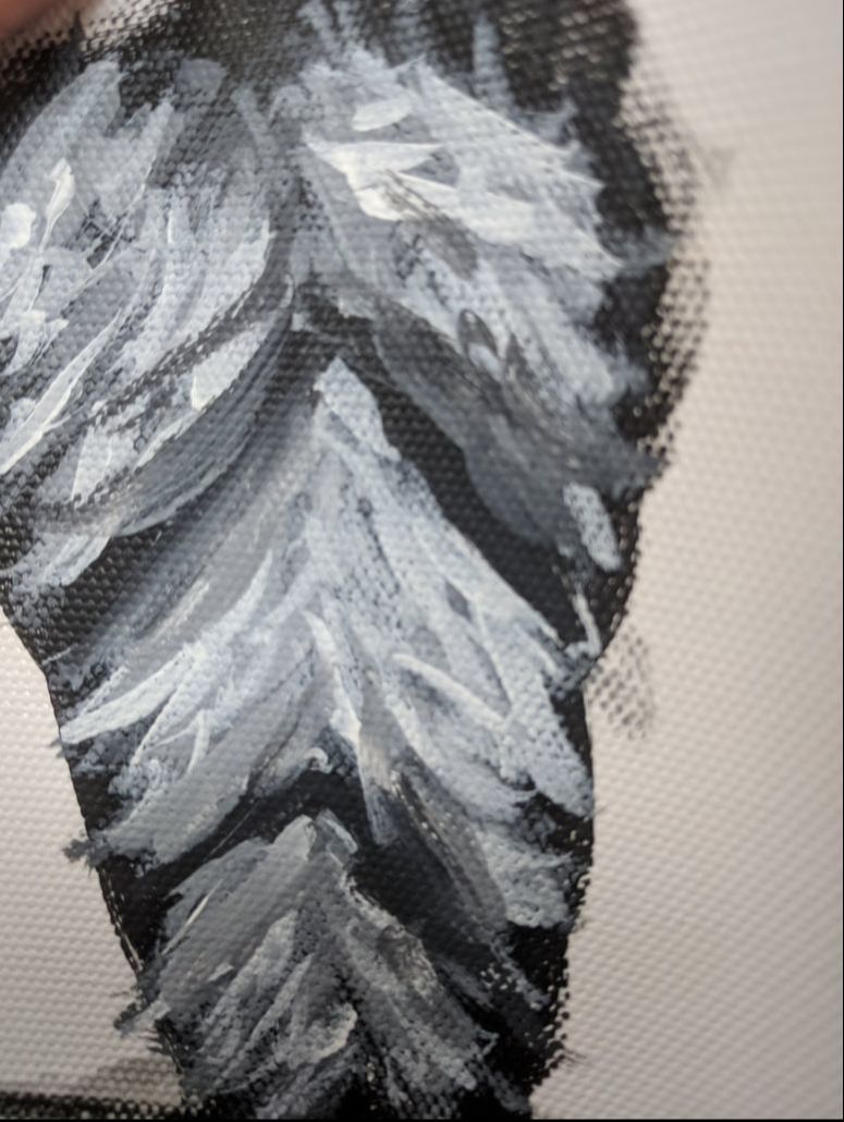
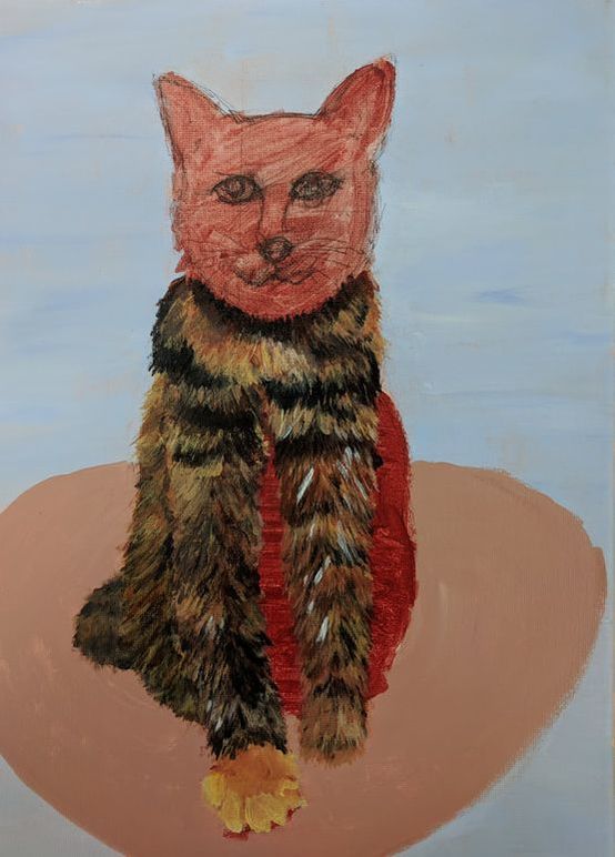
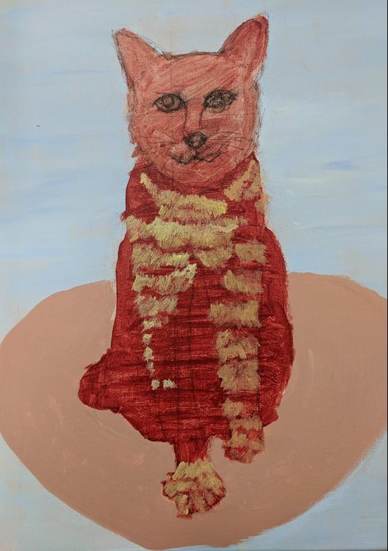
For my pet portrait I started with an acrylic wash after I sketched out my painting on a canvas. Then what I did was painted the background and foreground to make it easier on me later on. To do the actual fur part I started by looking at my painting. I looked for lights and dark and how that effected the fur. Next I painted my whole cat a deep red to help the fur look more realistic. All of this work that I put in beforehand really helped my painting. Because I didn't use oil I couldn't get as realistic of a look but the way I layered the fur worked out very well. And the composition that the painting is in really draws your eyes to my cat because it is the main piece. Overall I feel like I did a pretty good job with my painting - Discuss how accomplished value, texture, layering, blending, contrast and realism. What is the most important aesthetic quality of your painting? If you are unsure what aesthetic means then look up the meaning and write it with your critique. To create texture in my painting I did a few different things. First I looked for the lights and dark in my painting . After doing that I looked for groups of similar colors of fur. To really create texture though I started by painting the lightest fur in the shapes I saw on the picture. From there I added in the darker colors. Once I got all of the colors in I would go back in with a few of the previous colors and find places where it was more blended in the picture and work on doing that by mixing the colors together. Another thing that helped was all the layering of colors I did especially in the shadowed parts that made my cat the most aesthetic part of my painting.
- Explain your creative process. Discuss how you used techniques learned in class to create a successful painting. My creative process was the same as for all the previous projects. First I got pictures and sketched out some ideas for my painting. Then in class we worked on fur only using white and black to show the transition of color and the process of making fur. I used this process a lot once I sketched out my painting on the canvas and gave it a wash. Because of the fact I was working with fur I painted the background and the foreground before I painted the fur. But for the most part all of the techniques I used in this painting we learned in class.
- Reflect your growth through the project. I had two main areas of growth in this project. The first and biggest one was the ability to paint fur and faces, even though it was an animal face. Before this painting I had never painted fur or any animal every. But in class we were taught how to paint fur, and through practice I think I ended up becoming pretty good at fur. And for the face Mrs. Rossi helped me sketch out my cat's face which helped me learn how to paint faces. The other way I grew was with cloth. My cat's bed was very hard to do because of the 3D aspect of it. But I added in lights and shadows and tried to follow the picture as best I could and I feel like I learned a lot about cloth. Overall I learned a lot about new painting techniques.
- Discuss craftsmanship and quality of your painting. My painting was overall pretty well done. The best part and the part that had the highest quality was the body of my cat. The face was pretty good but I think I could have done more to make it more realistic. The bed had a lot more things I could have done like added in the texture of the bed, work on the folds and creases and a few other things. But for the most part my painting was well crafted and had a very high quality.
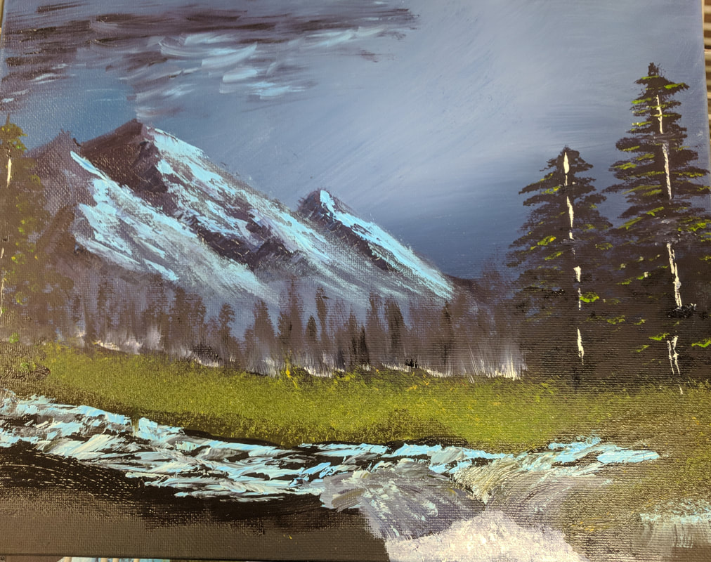
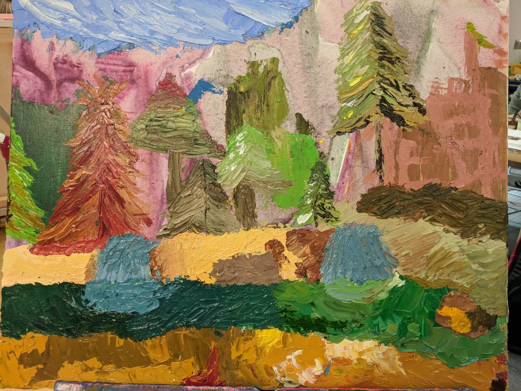
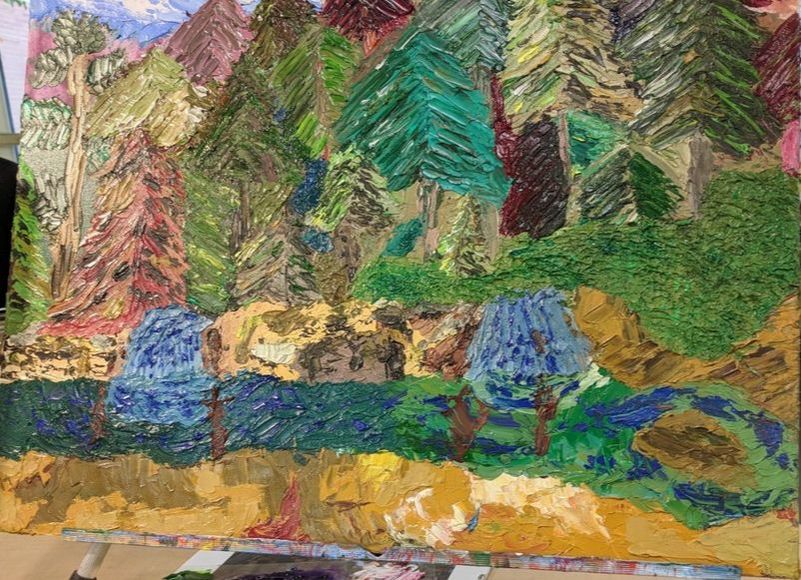
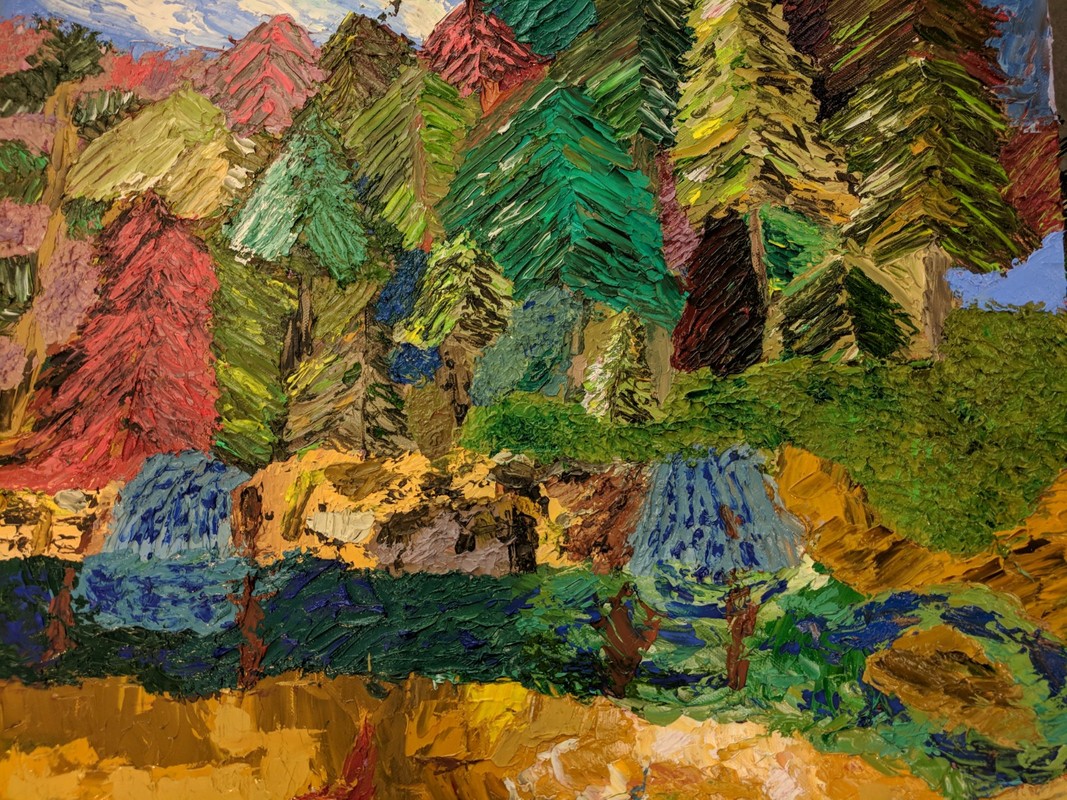
Textured Landscape
|
|
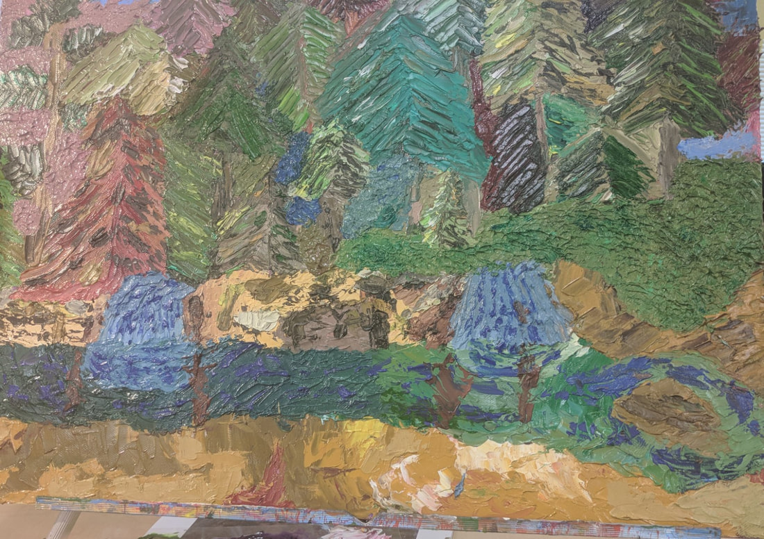
For our next painting we worked on a textured landscape. I did mine with pallet knife and it was very textured.
Painting Critique- Landscape
Self Evaluation
1.Describe the craftsmanship of your painting. (Is it neat and well executed?)
My painting is neat for the way I was painting it. I was using only a pallet knife. Because I used a pallet knife it is neat for that type of tool, because sometimes it was hard to get details exactly where I wanted them. And for my style I think the painting is well executed. The trees for the most part were well made like the rest of my painting except for a few small parts and colors.
2.Describe your choice of colors/color harmonies and how you used them throughout the artwork.
Throughout my painting I followed the colors of my pictures for the majority of the time. But in my trees I added a few different colors. When you look at the picture you see a lot of green and brown. But I used a lot of different colors for the dark and warm part. For example on a tree that looked mostly green I did a few different shades of green with a little bit of yellow and purples in the warm and cool parts. For the most part the colors work well together looking like a forest but at the same time not being overwhelmingly green.
3.How did you create contrast in your painting?
There was contrast all over my painting. To start the rocks and the river at the bottom where textured and colored differently. There was also a lot of contrast in my forest. Like I said earlier the forest was a lot of green and brown. But to contrast the trees more I would do a mostly green tree with a red or brown tree nearby. I repeated this process a lot in the forested part of the painting. This really brought out some trees. When you look at the painting every time you will notice a different tree and same thing if you look close up and from far away. The contrast will show you something new every time.
4.How did you apply textures, highlights and shadows to enhance your artwork?
This was a textured landscape so I went for a lot of texture in my painting. That is why I used a pallet knife. In the trees and rocks especially I used a lot of paint, so when I spread it out there is an excess amount which I spread out unevenly to create a lot of texture. In the rocks this creates a rocky look and in the trees it makes them look like they are not all uniform. I also used a lot of highlights and shadows. You can see a lot of highlights and shadows in trees. Where the sun was shining I added whites and yellow into the green and brown. Where the shadowed parts I added purples and browns and blue to create the shadowed look. These three things together created a more realistic look.
5.How were you able to create depth in your painting?
In my painting I used a lot of texture and highlights and shadows to create depth. A lot of my painting was the forest and like I have said earlier the use of colors in the trees in the light and dark parts created depth. In my rocks I used lighter browns for a lot of it but then I went through the picture and where the shadow was casting I used a dark brown and for the lighter parts I used yellow. In the water there was different greens and blue. All of this color use and texture in my painting created lots of depth.
6.What painting techniques did you use that made your painting successful?
To start my painting I used an under painting with analogous colors. This means for each color on the painting I used and acrylic wash of the opposite color on the color wheel. After that I used a pallet knife. Beyond that I did not really use many techniques. Overall the few techniques I used made my painting work well.
- Describe any difficulties you had creating your drawing and what you could do to improve your drawing?
- Explain the successes you had with this painting.
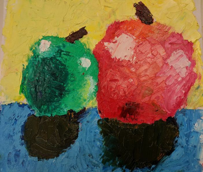
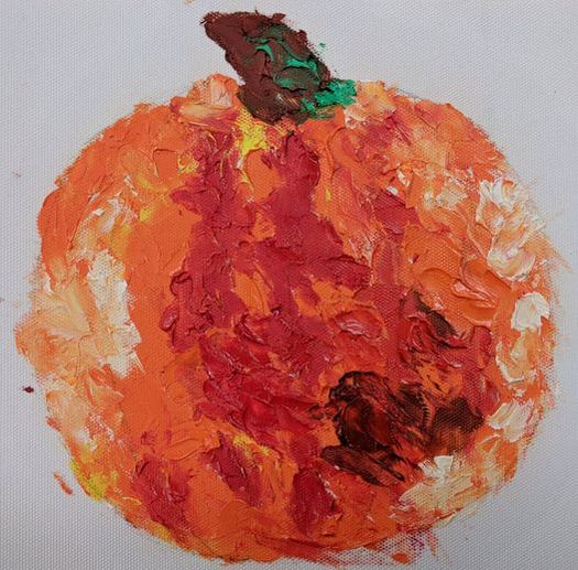
Oil practice with a brush and palette knife
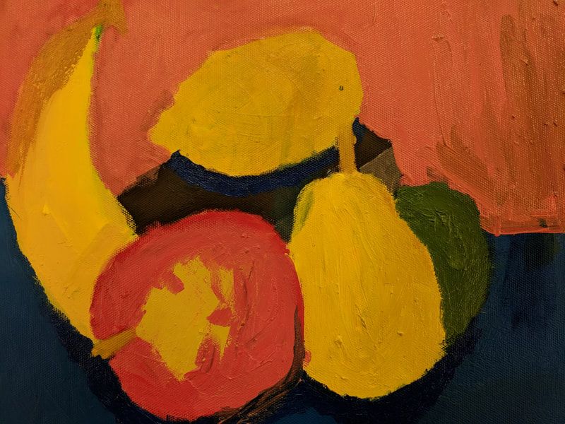
This is my oil still life. Ir was my first time using oils and a brush. I think it was good for the most part except for the apple I had a lot of trouble with the red and yellow blend. I spilled some water on my painting half way through so the colors ran a bit but I think I did a good job.
This is my palette knife painting. It was my first time using oil paint and using a palette knife to paint. It was a lot of fun because you didn't have to create the exact color. You would paint each color where you saw it. The paint mixed really easily, but I had a lot of fun for my first time using a palette knife on a painting.
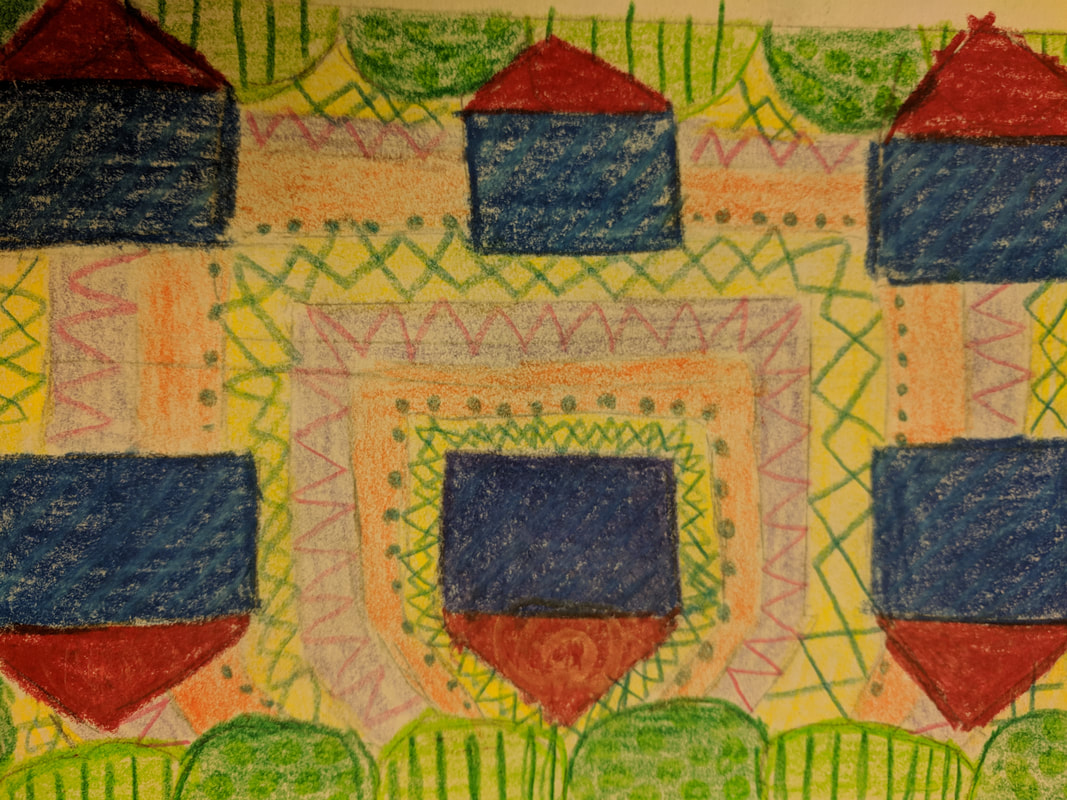
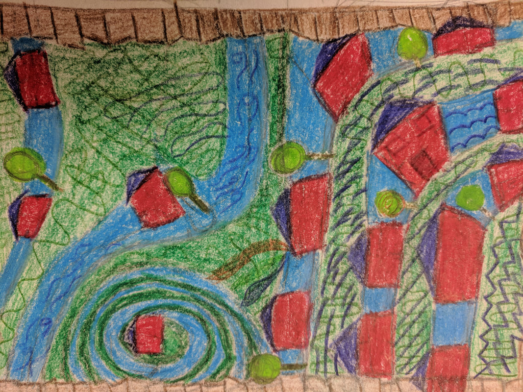
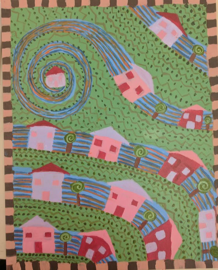
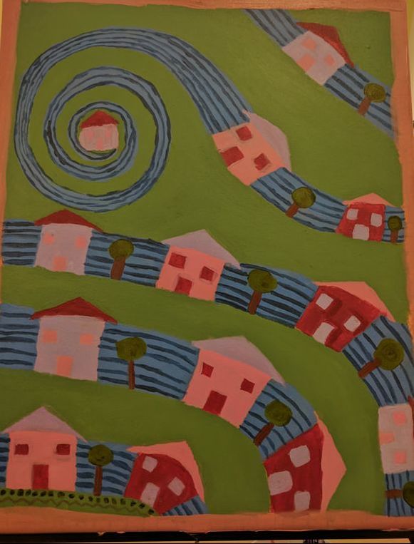
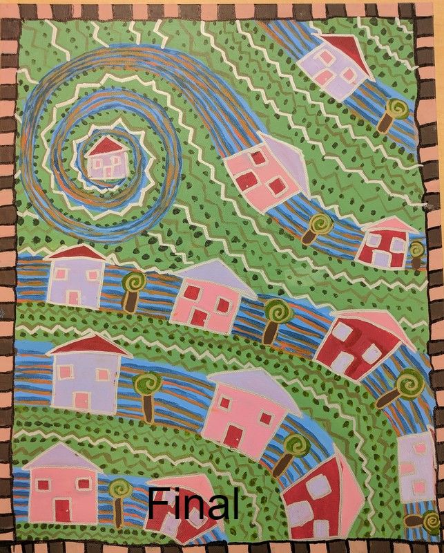
Hundertwasser Critique questions
1.Describe the craftsmanship of your painting. (Is it neat and well executed?)My painting had a good craftsmanship. Originally it wasn’t to neat, but then I added the border on and added sharpie around the edges to sharpen and enhance the neatness. I think that going from my picture to my drawings, to the painting that it is well executed because I followed closely to my drawing at the artist’s paintings to create mine.
2.How does your work embody the artist’s style?Hunderwasser did a lot of patters, repetition, distortion, stylization, and borders in his paintings. Through my work I tried to add as many of these elements as I could. I did a pattern on the blue and green parts, and the houses were repetitious in their patterns of the color. The streets and some of the houses have been distorted and the trees are stylized with some patterns in the middles. To finish off my work I added a border around the edge of the painting to make my work embody Huderwasser’s work as much as possible.
3.Describe your choice of colors/color harmonies and how you used them throughout the artwork.My color choices did not really have much meaning in them. I picked three colors that went well together and rotated each one on each part of the house. The trees I did green for the top and brown for the trunk. The part of the painting connected to the houses I made it blue, and the “road” part I made green. The border was two different shades of brown alternating. The colors work well with each other while not being the typical colors you would’ve thought to paint this painting in.
4.What is the emphasis (focal point) of your artwork?My painting is of my neighborhood in a sense. So, I made the focal point my house. My house is top left with a spiral circulating around it which leads into the other houses and the rest of the painting. When you first look at the painting your eyes are drawn to the lone house and the spiral around it, which is the point, and your eyes follow the path to the rest of the painting.
5.How did you use textures and patterns to embellish your artwork?Originally, I painting everything in a single color and it looked ok, but then I started to add some patterns into each part of the painting and it started to make the painting a lot better. For example on my trees originally they were just solid green with a brown base, but then I added a gold spiral in each and it made each tree pop. The same thing happened when I added the pattern to the green part of the painting, it made the painting look a lot better.
6.How did you put a border on your artwork? How does it enhance the work?To add a border all I did was wait until I was done with a majority of the painting then I mixed two different shades of brown. Then I painted the whole border 1 brown. After that dried I added the other brown to alternate the border between the two colors. Then I went over the border with a black sharpie to really separate the border from the rest of the painting. It enhances the work by making the piece look controlled and having an edge around the main part.
7.Describe any difficulties you had creating this artwork.One major difficulty that I had was with my paint. After I was done with about ¾ of my painting all of my pain dried out, so I had to mix more of the same colors. This proved difficult because it was hard to mix the exact shade as before. So, I couldn’t mess up on the parts that I already painted or otherwise I would have to repaint that whole part. Eventually after I worked on it for a while I finally made most of the colors I had before.
|
|
|
|
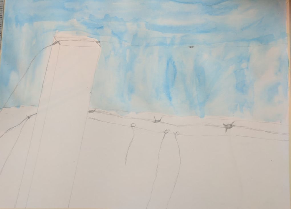
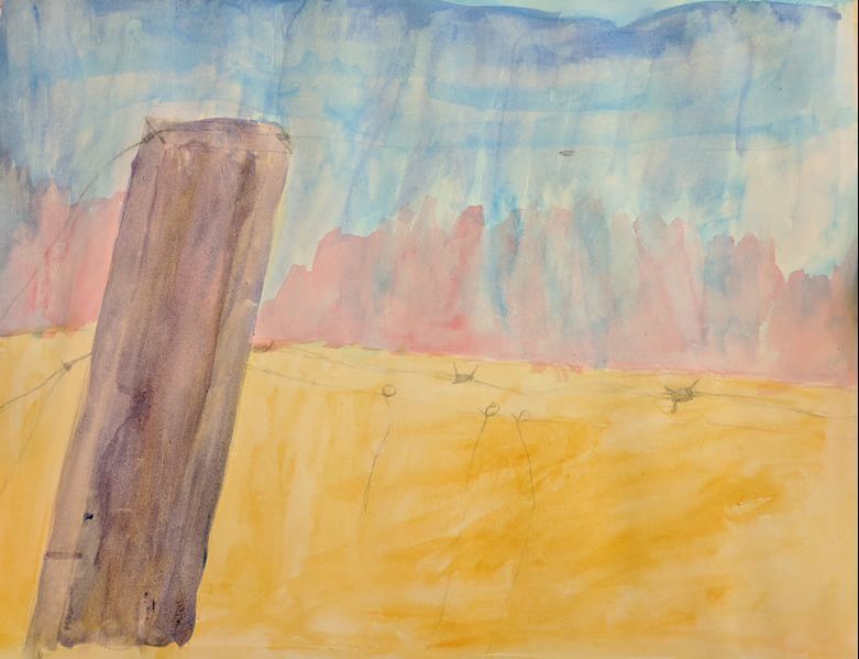
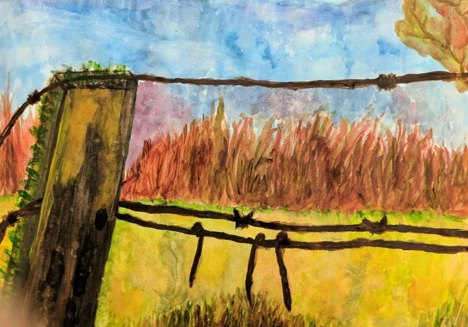
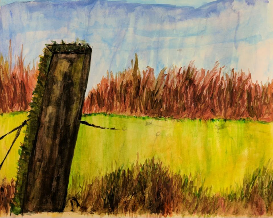
Watercolor painting critique questions
1. What watercolor techniques proved to be effective in your painting? How and Why?
During my time doing my watercolor painting I used a lot of different techniques. One of the most effective techniques I used was dry on wet. In my painting there was a lot of different colors in the grass. So to do this I used dry on wet. This was effective because I did a wash of a red over the whole background. Then I went over the whole area with the grass with a red brown on the top part and green yellow on the bottom. Then I randomly went in with different colors and did long vertical strokes to look like the grass. This turned out well because the mix of colors with the wash created an area of grass with unique colors.
2. How important was using transparent layers in your painting?
To start my painting I did a blue wash on the top and a red wash on the bottom. So I started with really light colors and slowly built it up. Slowly building it up made the colors realistic and have more depth. Transparent layers make the painting with more depth and with the sky and grass it can show some colors in the background like a red without painting with red in the grass.
3. Explain how your composition was successful? Did you utilize all the elements of art and principles of design? Explain.
Yes I think my composition was successful. With my watercolor techniques I used a majority of them in my composition like dry on wet, wet on wet, and crayon. I utilized many of the elements of art and principles of design. There was balance between the grass and the sky and with the close post and the background and tree. I used movement in the grass with painting the blades of grass and the sky with the different colors across the top. And finally proportion with the post compared to the background
4. Was color choice an important factor in the overall success of the painting? Why?
I don't think the color choice was too important for the most part because a lot of the background colors was a wash with an overall color for that section. But with some parts the color was important. An example of this was my post. In the picture I looks black and yellow , but I can't do that for my water color. So I picked purple, browns, and yellow greens. Then on the dark side I used purple yellow and brown. The other side I did brown green and yellow. Because of the color choice for each side I looks like there is a shadow on the painting and that was the effect I was going for.
5. Describe your craftsmanship.
I think I had pretty good craftsmanship on my painting. I started with a wash then slowly built up the painting with layers of color. This was good work on my part because I think that slowly working the paper made the painting more like the picture and made my color choices work a lot better. A lot of my previous watercolor paintings I overworked the paper, but this time I took more time and slowly worked the paper instead of rushing it. This slowly working process helped my craftsmanship.
6. If you were able to do something different what would it be and why?
If I was able to do something different would be the grass that are not the bladed parts. The part where I did not do the blade strokes looks to undefined for this project. Next time I would try to put more detail in the hilly grass to try and fit it in with the overall picture.
10. Explain to me what you have learned about watercolor and how it has improved or discouraged your development in art.
I have learned a lot of different painting techniques and how to paint a picture in different colors to see it in a different color. Some of the stuff I learned for painting was gradient, wash, wet on wet, dry on wet, wet on dry, dry on dry, salt water, bleach water, saran wrap, and crayon. This will help me in my future when I am painting more. Because of all the techniques I learned I think watercolor has helped my development in art and with my painting
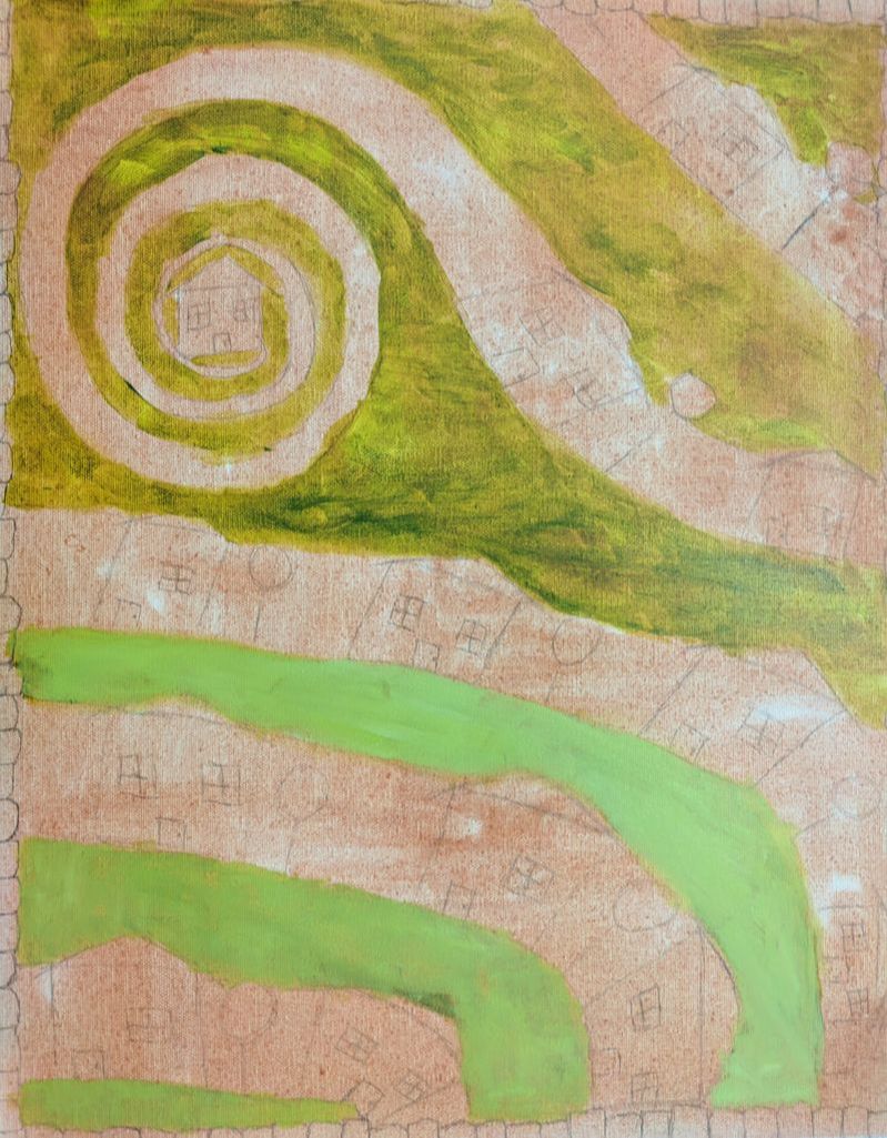
Water Color Apples. Again. Yay.
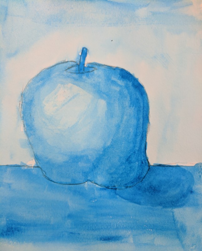
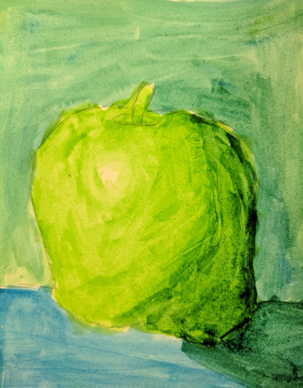
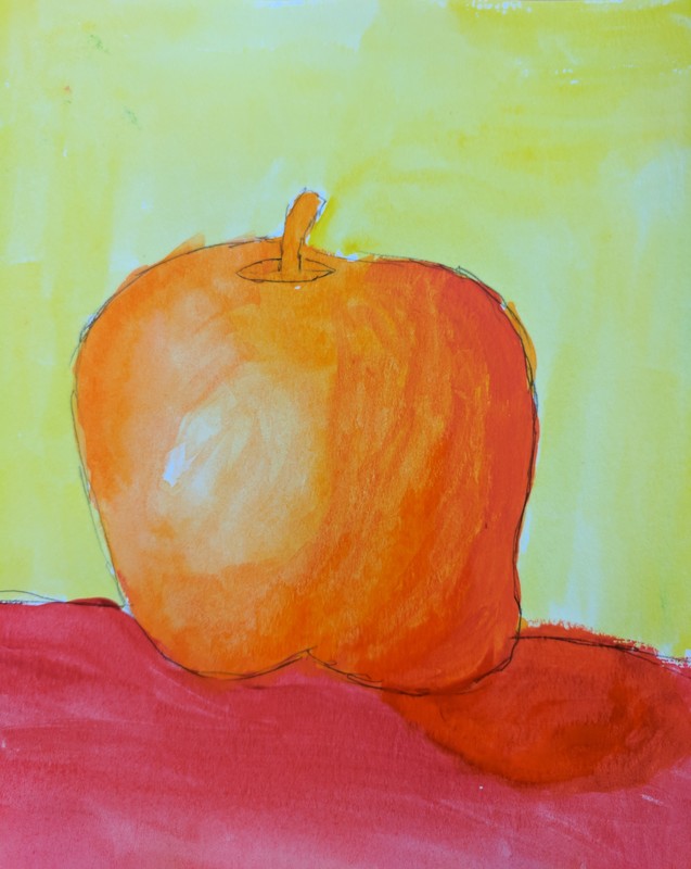
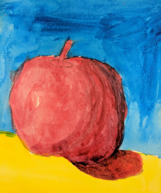
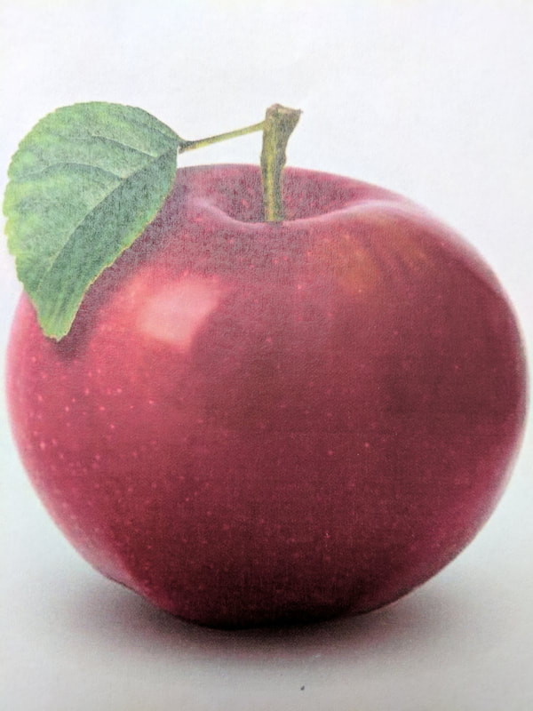
Our first mini project was water color apples. We had to do 4 different pictures and all in a different color scheme. Technically you could pick any fruit but I picked to do apples again like in art 2. My first apple, the first one was done in a monochromatic style. First I drew the apple and the table that it was on. Then I picked blue to use and started to make different values. I started on the darker side of the apple. I kept adding water to make the value lighter until I had done the apple. Then I did the background lighter and the table a little darker. The second apple was done in a cool color style. This means colors like the greens, blues, and purples. I did the apple green and a little blue in the dark parts. I did the table a blue, the background was a blue green and the apple shadow was a darker blue green. The third apple I did was in warm color style. I picked orange for the apple cause it was a mix between red and yellow. I followed the same technique that I did for my cool color apple but in warm colors. My fourth apple was done in Triadic style. First I picked the three colors that I wanted to use, but they had to make a triangle on the color wheel. I picked red, yellow, and blue. Again I did the same technique making the table darker and the background lighter. This time I added a bit of blue to the apples' dark part and shadow. The last picture is the reference picture I used on this project.
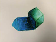
Value chart and forms in Watercolor
Another project that we had was value chart and forms in watercolor. This is sorta a combination of what we have done so far. We took a form and did more practice with shading and transitions with watercolor. This took more skill than the prisma because you could not just keep going over it until you got it to look good. You had to blend the colors before you painted it on and then add water to do a gradient to the lighter colors.
Watercolor Pencil Practice
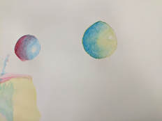
This is my watercolor pencil practice. I was trying to shade a circle with watercolor pencil. To start I started with the darker color and did the darker part of the shape and then slowly applied less pressure. Then I took the lighter color and blended it into the dark color. After that I added water to the shape to make it into water color, because with watercolor pencils you do all the shading then add the water to make it a watercolor picture.
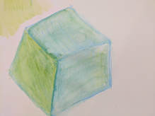
Shape Shading with Prisma
This was our first art task. We all got a form, I got a cube, and then we used Prisma to shade. This is not the first time that I have used Prisma so I think it turned out pretty decent. I like how I did my light transitions with different colors. I don't really like how I did my shadow, I should have layered more Prisma on my shadows.
