Clay Food


1.Describe the craftsmanship of your sculpture. (Is it neat and well executed?)
For the most it is well crafted and neat except for some Oreos. My cup and bowl are fairly neat and smooth. With each creation I made sure that I scored and slipped and neatly smoothed the clay. Score and slip is important because it holds the clay from breaking apart during the firing.
2.What was the most difficult part of this project?
The most difficult part was the bowl because it is at such a weird angle and it was hard to make it stay together. To make the bowl I first rolled out a sheet of clay, then I cut out the bottom and the whole side of the bowl. Afterwards I scored and slipped it all together.
3.Did your color choices work together harmoniously?
Yes my bowl is blue with a white swirl and my cup is red with a pink swirl and the go together very well. Using the different that contrast each other really draw your attention to the Oreos which are the main point of the clay foods.
4.Is your sculpture interesting from all views?
Yes every different angle is interesting and colorful except from the bottom. I made sure I detailed every side, for example on the top of my Oreo I carved out the pattern, and on the side I made it look like the side of the cook with some lines.
5.Describe the differences in constructing a sculpture and doing something 2D.
A sculpture needs details on every side and you must pay attention to every side, but a 2D painting is only from one angle. Every single side of the a sculpture must have the same level of detail so that the whole thing looks good, unlike a 2D thing where you only need to pay attention to one side.
6.How did you create textures in your sculpture?
On top of the Oreos I cut the details out of the top to make it seem more like the Oreos. I found a picture of the top of an Oreo and cut that out pretty accurately.
7.Does your sculpture look like the actual food? How did you accomplish this?
In some aspects it does look like Oreo and in others it does not. The part that looks like food is the cookies on top, while the middle part of it does not really look like cream, like it should.
8.What would you do differently if you were to do this project again?
Next time I would not do Oreos there was a lot of detail in small spaces and the painting of the cookies was very hard to get right.
Painting in the style of an Artist


1.Who was your referenced artist for the painting? Name 4 main ideas you used from your research to create your painting.
Name-Georges Braque
2.Describe the craftsmanship of your painting. (Is it neat and well executed?)
It is well executed and neat and you can tell that it is a cup but it is still in a cubism form. I think the cup is very well executed because it is neat , but yet it is still in the style that I was trying to make it in.
3.What was the most difficult part of this project?
The most difficult part of this project was breaking the image up to make it in the cubist style. It was difficult because first I had to draw the whole thing, then fracture it with lines through every part. At the end, I had to blend the background so the attention was on the fore ground.
4.Describe your color choices and how they reflect the work of your chosen artist?
It has a lot of grey and blacks with more color in the actual cup like how Georges Braque did his work. The whole surrounding area was more of a grey with a few colors throughout, but once it got to the actual cup, like Georges Braque, I added more colors to make it stand out even more.
5.Describe how the style of your landscape reflects your chosen artist.
First, like Georges Braque I broke up the image and then I painted each different section a different color. I took the image and broke it up to a point, but you can still tell what it is well enough. But it also makes you think about where it all begins and ends.
6.What do you think your chosen artist would say if he or she could see your painting today?
This is in the cubism category, but not in the exact way I would do it. But you stilled captured the essence of cubism by breaking up the cup and background of the images.
7.What would you do differently if you were to do this project again?
If I was to do this project again, I would keep the style because I like it, but I would change the picture, colors I use, and the exact way I execute the painting.
Name-Georges Braque
- Broken images
- life
- Cool Colors
- Cubism
2.Describe the craftsmanship of your painting. (Is it neat and well executed?)
It is well executed and neat and you can tell that it is a cup but it is still in a cubism form. I think the cup is very well executed because it is neat , but yet it is still in the style that I was trying to make it in.
3.What was the most difficult part of this project?
The most difficult part of this project was breaking the image up to make it in the cubist style. It was difficult because first I had to draw the whole thing, then fracture it with lines through every part. At the end, I had to blend the background so the attention was on the fore ground.
4.Describe your color choices and how they reflect the work of your chosen artist?
It has a lot of grey and blacks with more color in the actual cup like how Georges Braque did his work. The whole surrounding area was more of a grey with a few colors throughout, but once it got to the actual cup, like Georges Braque, I added more colors to make it stand out even more.
5.Describe how the style of your landscape reflects your chosen artist.
First, like Georges Braque I broke up the image and then I painted each different section a different color. I took the image and broke it up to a point, but you can still tell what it is well enough. But it also makes you think about where it all begins and ends.
6.What do you think your chosen artist would say if he or she could see your painting today?
This is in the cubism category, but not in the exact way I would do it. But you stilled captured the essence of cubism by breaking up the cup and background of the images.
7.What would you do differently if you were to do this project again?
If I was to do this project again, I would keep the style because I like it, but I would change the picture, colors I use, and the exact way I execute the painting.
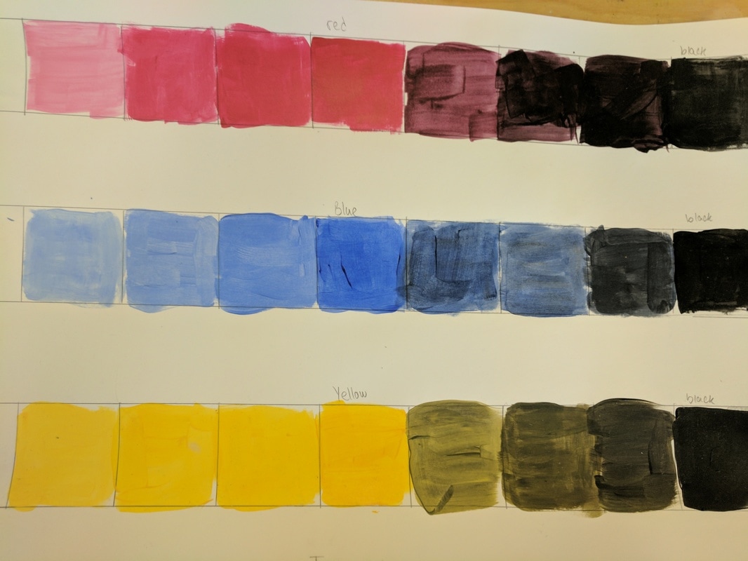
Value Chart
In our value charts we took a color and added white to one side and black to the other. We had to do this for three different colors.
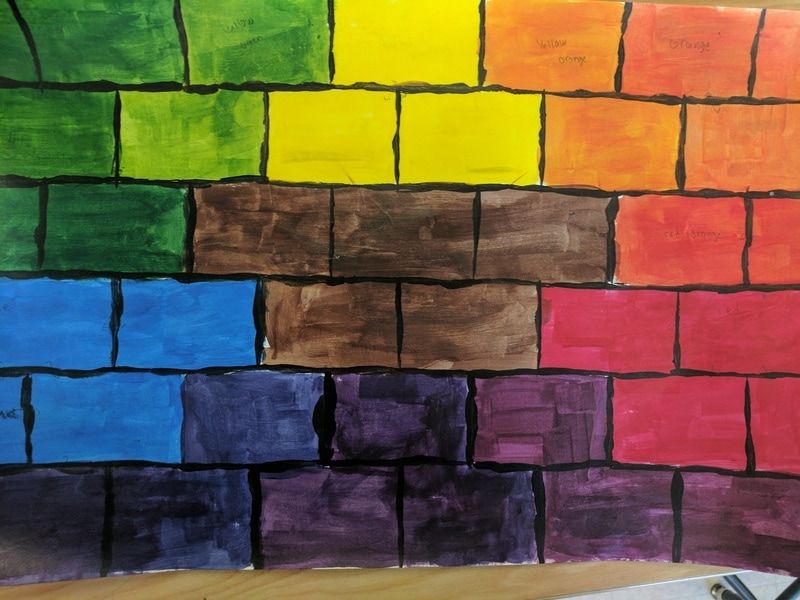
Color wheel
For our color wheel we had to do an innovative idea. I did mine in a wal shape with the colors in a circle and brown in the middle of the painting. Each color takes a few bricks to spread each color evenly
| georgebraque.pdf |
Clay food
For my clay food I made Oreo's with a plate and a mug. The mug was fairly easy to make. The Oreo's were fairly simple, I cut their designs out of the clay. Then I scored and slipped all the pieces together.


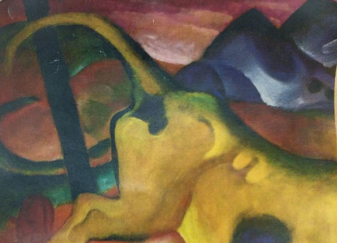
Yellow Cow painting
In this project everyone got one part of a picture to paint. I got one part of a yellow cow to paint. I made it to as close to the picture as possible. I think i did a fairly good job on this with my mixing of colors.

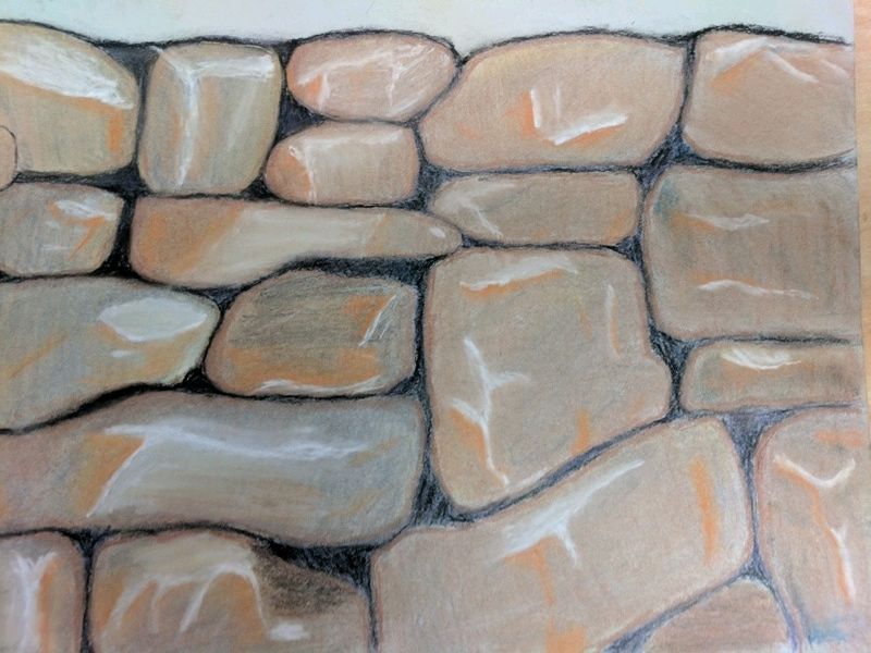
O’Keeffe Inspired Drawings
Self Evaluation
1.Describe the craftsmanship of your drawing. (Is it neat and well executed?)
My drawing is very neat and I think very well executed. My goal was to make my drawing semi realistic and I believe that I achieved that.
2.Do you think you used a full range of values to create the illusion of depth?
I believe that I did use a full range around the edges and dark parts of my drawing to achieve the illusion of depth on my rock wall
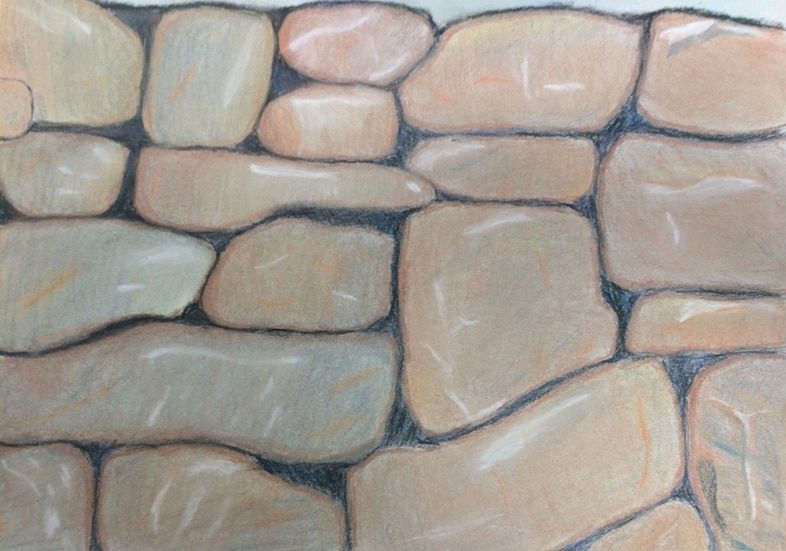
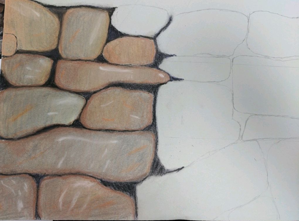
3.How do you think you represented the style of the artist Georgia O’ Keeffe?
I represented the style by drawing a rock wall up close and really showing the texture. With the texture and up close picture it was a lot like Georgia O’Keeffe.
4.Describe your choice of colors/color harmonies and how you used them throughout the artwork.
I used a lot of browns and greys. My rocks were fairly light color but still mostly brown and grey. So I did a light layer of brown, added in some highlights of different color and then finished with a layer of grey.
5.How did you create contrast in your drawing?
I created contrast by adding black and purple between rocks to show the dark areas in the wall, and making some parts that had light hitting it lighter with white and yellow.
6.How did you use textures, highlights and shadows to enhance your artwork?
I used texture to make the rocks look more realistic. I used highlights where the light hit the rocks and I used shadows where there was no light or no rocks.
7.Describe any difficulties you had creating your drawing and what you could do to improve your drawing?
I had difficulty at first adding texture to my rocks. I could not figure out how to add it and make it look realistic enough. I think to enhance my drawing I could add more texture to the rocks and maybe work on the areas of light a bit more.
Self Evaluation
1.Describe the craftsmanship of your drawing. (Is it neat and well executed?)
My drawing is very neat and I think very well executed. My goal was to make my drawing semi realistic and I believe that I achieved that.
2.Do you think you used a full range of values to create the illusion of depth?
I believe that I did use a full range around the edges and dark parts of my drawing to achieve the illusion of depth on my rock wall
3.How do you think you represented the style of the artist Georgia O’ Keeffe?
I represented the style by drawing a rock wall up close and really showing the texture. With the texture and up close picture it was a lot like Georgia O’Keeffe.
4.Describe your choice of colors/color harmonies and how you used them throughout the artwork.
I used a lot of browns and greys. My rocks were fairly light color but still mostly brown and grey. So I did a light layer of brown, added in some highlights of different color and then finished with a layer of grey.
5.How did you create contrast in your drawing?
I created contrast by adding black and purple between rocks to show the dark areas in the wall, and making some parts that had light hitting it lighter with white and yellow.
6.How did you use textures, highlights and shadows to enhance your artwork?
I used texture to make the rocks look more realistic. I used highlights where the light hit the rocks and I used shadows where there was no light or no rocks.
7.Describe any difficulties you had creating your drawing and what you could do to improve your drawing?
I had difficulty at first adding texture to my rocks. I could not figure out how to add it and make it look realistic enough. I think to enhance my drawing I could add more texture to the rocks and maybe work on the areas of light a bit more.
pastel


These are the begging of my pastel work. On the left side you can see the different techniques I used for pastel.
prisma color


In these photos you can see my use of prismacolor. The circles were the first attempt of using them. Then I started blending with the fruits. With prisma color all you do is keep layering. My fruits turned out well.
water Color value chart-was not here
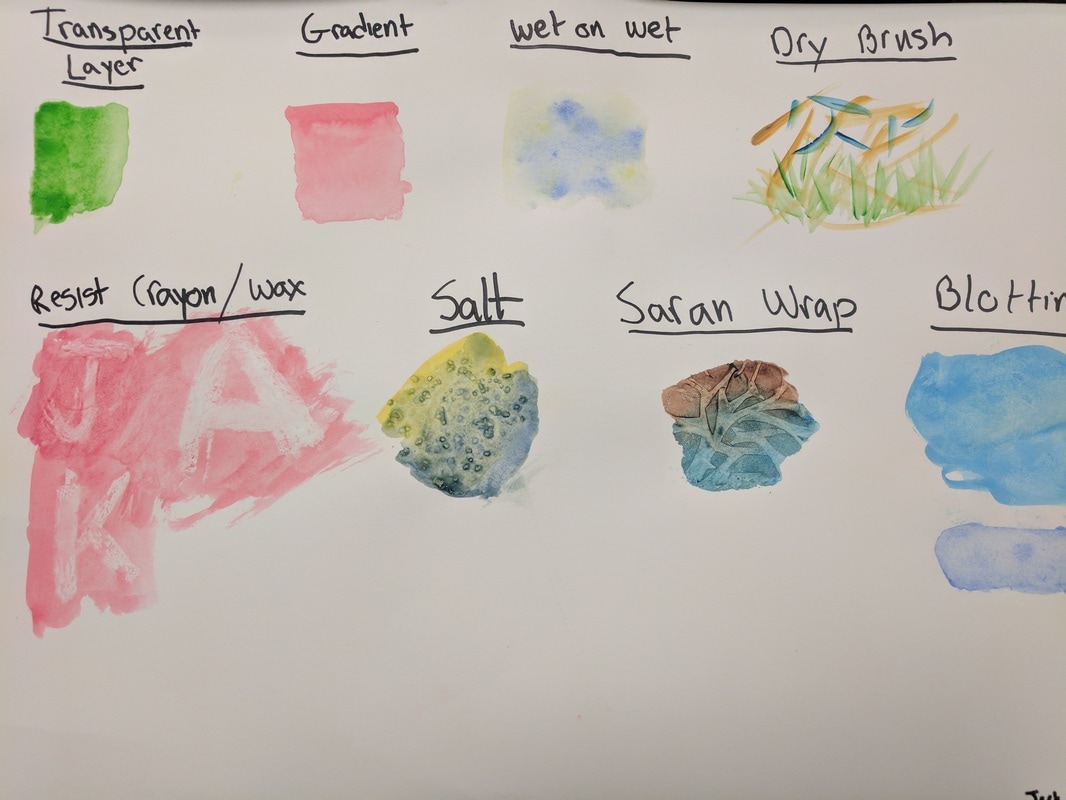
Water Color Technique
These four photos are showing different ways to use water color. Some of the techniques are tones of blue, watercolor pencils, watercolor with salt, and water color with prisma color.


SELF EVALUATION
1.Discuss your decision on pen and ink techniques. Why you chose to use one or more?
I did stippling for my pen and ink drawing. I chose to do my picture this way because if it is done correctly it can show a lot of value. Also I only did one technique because mixing in more than one looks weird on my picture.
2.How did you use perspective?
Why is perspective important?I used one point perspective for this drawing. It is important to show depth and dimension on a picture.
3.How is texture important in your composition?
Texture is important for the composition because it can really make a picture seem life like and make it look realistic.
4.Why is value so important in this project?
Value is important to this project because we did not use colors. Through the use of value we did not need colors, because the value showed where the light areas and dark areas were and how they were separate.
5.Describe your craftsmanship (How well the project is crafted technically)
My craftsmanship is fairly good on the main part of the project, except for the top. I will go back in the future and make the quality a lot better.
6.If you could recreate your piece what would you do differently to enhance your final outcome?
I would make the top of my picture a lot more detailed, because like I said it is not that good right now.
7.When applying the pen and ink techniques why and how is it important to make sure you understand the concepts taught in class?
Because if we do not understand the 4 different techniques we learn in class, then we cannot use those techniques in our art.
8.As a growing artist how do you think what you have learned will guide and better your future projects.
This project has really taught me perspective, and it has helped me with value and time management, which hopefully I can do better in the future.
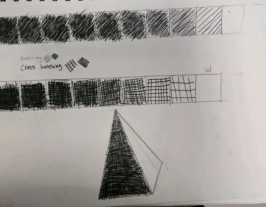
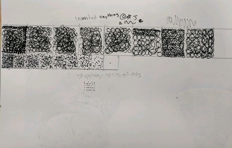
Each of these pictures show a different pen and ink shading value. Cross hatching which uses a value of two lines, a hatching which uses one line, innovative which uses whatever you want, and stippling which uses dots to show value.
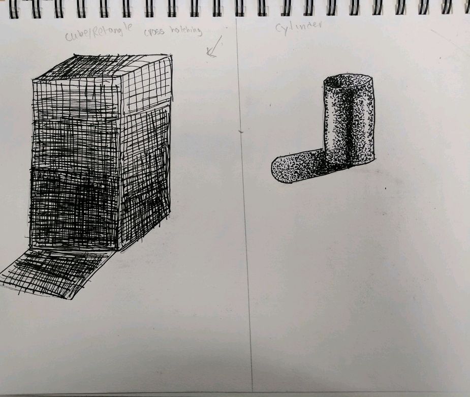
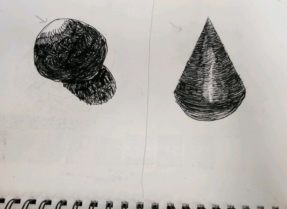
These are my shapes put into different value. For every different shape I used a different pen and ink value.
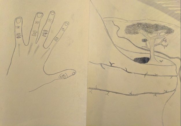
Assessment Drawings
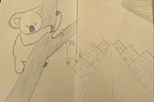
These are my assessment sketches. There are four of them, an animal in it's natural habitat, a tree in a landscape, a street scene, and a realistic hand.
Perspective Drawings
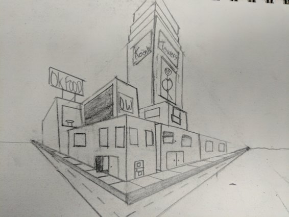
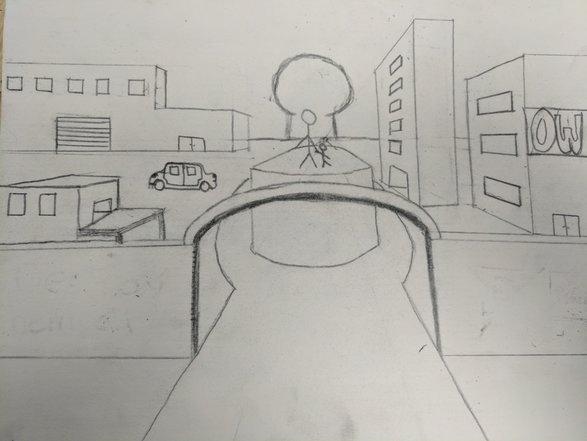
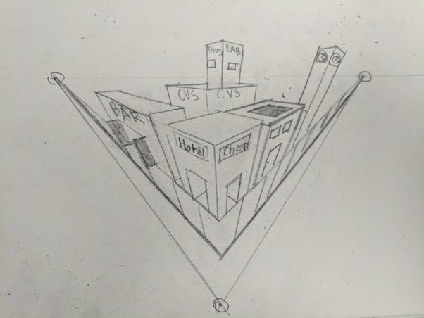
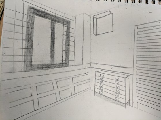
These are my perspective drawings. There is 1,2,3 and a corner of a room. 1 point you have 1 vanish point in the middle and all side lines go to that point. With 2 point, there are 2 vanish points. With 3 point there is also a point above or below the horizon line that the vertical lines vanish to.
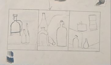
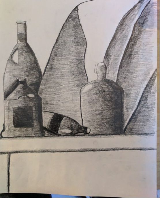
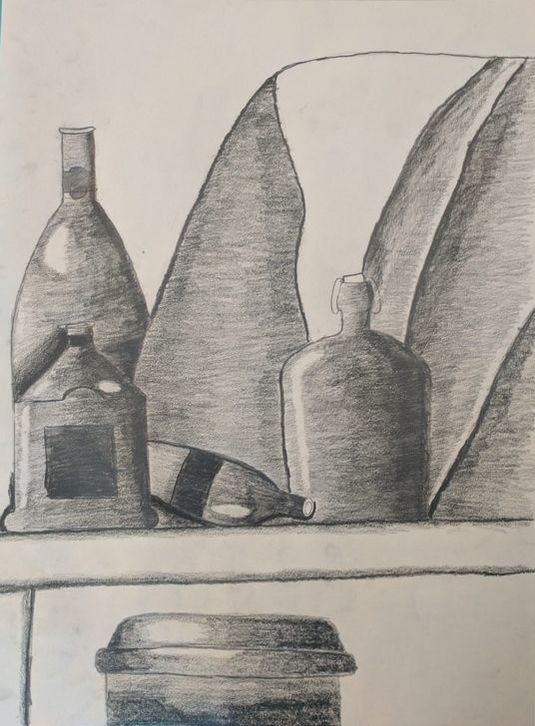
Pencil Still Life
|
|
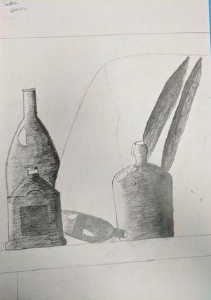
This is where my process started I picked three different areas with four bottles and did a simple line sketch of each. The line sketch were just simple drawing that we did to figure out which one would draw on the big composition. I ended up using the middle sketch and adding a lot more details. I do not have an image of the original, but i added a lot of new details in. After I had the line sketch I started to add values to the bottles and the cloth behind them. Originally my values where not the smoothest, but over a couple of days I improved each bottle and the cloth. There are a couple of examples of this. The first one is how the cloth on the left was in a set area and not fading into a gradient like it should. Show I decreased the original value and lessened it until it faded away. The second example of this is bottle in the very back, I added more value around around the neck of the bottle in front of it. Over all I think that my composition came out well.
SELF EVALUATION
1.Describe how you arranged your composition. Discuss your use of the elements and principles. Is it a successful composition?
I arranged my composition to cover different parts of the whole area. I moved each one to cover different bottles and be at a varying distance. I tried to keep a balance of empty space to space filled with bottles. I used lines and shapes to create my bottles and the different items in the background. Then I put the best one onto a larger page and used different values to make my composition look as if it had space and depth in it. I think that my composition was successful and turned out better than I originally thought it would have.
2.Did you use a wide range of values? (A range from white to black with at least 9 values). Explain how is this evident?
I did use a wide range of values to make my composition show more depth and space. There are spots that reflected the light that I made white along with the areas that had no shadow. Then I used black along the very dark edges to show where the light was hitting the bottles and then I slowly made the value lighter until I reached the white spots creating a gradient. This made the bottles look more 3D and using the wide range of values made different bottles appear at different distances making the overall composition better.
3.Explain how your knowledge and creating practice studies with value contributed to your piece.
My knowledge helped me to shade the bottles and cloth better. Through my practicing and previous experience I had a pretty good idea of how to complete this project and do it well. Working with values before made my transition even more realistic and made the transition smoother.
4.Describe the blending and transitions in your objects (discuss your use of pressure with pencil and other techniques to achieve this).
The transition in my objects ranged from darker to white. In most of my bottles, since the light was coming from the left, I started with a 7B with a lot of pressure towards to the left and started to slowly started to decrease the pressure until I either reached a reflection or the edge of the bottle. I did this process for all but the bottle behind another bottle. For the bottle in the back it was darker around the neck of the bottle in front of it. So in addition to shading it dark along the side, I also shaded along the neck. This created depth for the two bottles next to each other.
5.Explain how your interpretation of texture is essential in capturing the look of the object.
You have to be able to interpret the texture so that you will be able to capture the look. If you can’t interpret the texture than you will not be able to sketch it onto the composition. My bottles textures where all simple too capture, which made the look more realistic when I added value to my drawings.
6.If you could recreate your pieces what would you do differently to enhance the final outcome?
If I could recreate this piece I would have used more blank space and sized one of my bottles a little different. With my values, I would have changed the value on one of the bottles not so dark, because it looks like one side has no light on it which is somewhat true, but I would have made it a bit lighter. Overall though there is not much I would change to my final product. I think that I really shows my skills and my abilities with values.
